Post
Anscombe’s quartet
A lesson in graphing data
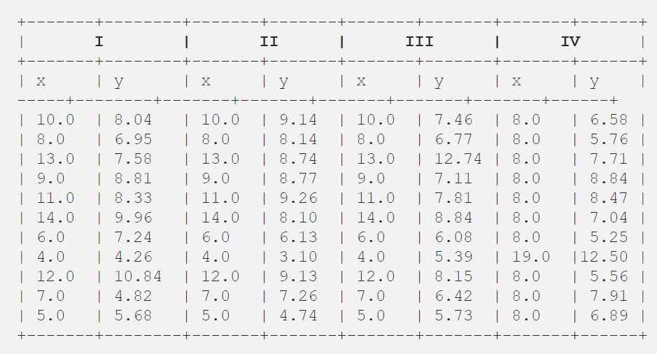
Anscombe's quartet is a group of datasets that have the same mean, standard deviation, and regression line, but which are qualitatively different. Named after the English statistician Frank Anscombe, it's a powerful illustration of the drawback of relying solely on basic descriptive statistics to summarize data.
The data in all of the graphs in the quartet are virtually identical when using standard descriptive methods, like mean, sample variance, and linear regression. The graphs reveal the truth.

The same data graphed
Anscombe's quartet is often used to illustrate the importance of looking at a set of data graphically before starting to analyze according to a particular type of relationship, and the inadequacy of basic statistical properties for describing realistic datasets. Looking at your data before analyzing it is something that Anscombe was passionate about:
Most kinds of statistical calculation rest on assumptions about the behavior of the data. Those assumptions may be false, and then the calculations may be misleading. We ought always to try to check whether the assumptions are reasonably correct; and if they are wrong we ought to be able to perceive in what ways they are wrong. Graphs are very valuable for these purposes.
— Frank Anscombe, Graphs in Statistical Analysis (1973)